First impressions mean a lot when you’re just starting out. A creative, well-designed, well-executed logo is an excellent way to make a great first impression. If you are thinking about starting a new insurance agency , a good logo is something you will absolutely need to be instantly recognizable, reach new clients, and succeed!
Why Do I Need a Logo?
A logo is a graphic that represents your business. It can be a standalone graphic, or the name of your company in a special font. Whichever one you select, a logo is the “face” of your business. Prospects and customers will look at your logo and make judgements on the quality of service to expect from your business. You need a good logo to make the best impression. Your logo will be seen on your business card, your website, and other marketing materials targeted at potential clients. So, be the most impressive and stand out from your competition!
Creating Your Logo
These days, you have many options when it comes to designing a logo. You can do it yourself with just a few clicks through a logo-making website such as PlaceIt, LogoMakr, FreeLogoDesign, or others. You can also employ a freelance graphic designer.
Some online design resources are free, while others may be available for a fee. Unlike the moniker suggests, “freelancers” do not work free. Some may “barter” their services, while most earn an hourly fee or charge a one-time design fee. You can search for a freelancer online using Google, Fiverr, 99Designs, UpWork, or other sites.
You can also use ProFinder on LinkedIn to locate a designer and get an estimate. While this process may take a little longer, your result may be better. This LinkedIn small business blog post, 32 Best Websites for Finding and Hiring Talented Freelance Designer, discusses other sites and resources.
Things to Know Before Starting
Before getting started, you may want to brainstorm some ideas that will help you – whether you’re designing the logo yourself or working with a freelancer. Come up with a couple of words you want to associate with your business. Think about words or phrases that relate to the service you offer such as personalized, confident, expert solutions. These are some examples that will help you get creative and think about the impression you want your logo to deliver.
Consider What the Competition is Doing
Once you have an idea of the kind of impression you feel your logo should have, it’s time to look at the competition. Find other businesses in your space, and see what they’re doing. The idea is to see what’s been done to avoid falling for a cliché that doesn’t set you apart, but rather makes you blend in with the competition. Seeing a great idea someone else did can inspire you to come up with something unique or new.
Think of a Business Name
If you don’t have a name for your insurance agency already, this is your opportunity to come up with one. For example, you may have noticed in reviewing what your competition is doing, businesses in the insurance industry often follow a pattern of “[Your Name] Insurance Services.” However, you are free to come up with something totally different, as long as whatever you select still helps people understand what it is you do and what sets you apart.
Consider a Tagline
Taglines may be seen as old-fashioned by some, but they can still help provide an additional way to convey the meaning of your business to your potential clients. Your logo doesn’t always have to have its tagline in every usage, but using one can sometimes be helpful.
Be Aware of Trends
Just like cargo pants in the 2000s, trends come and go. So do trends in logo design. It’s important to be aware of what the current logo trends are – so you can avoid getting stuck with a style that won’t stand the test of time. A good logo is timeless, but it’s okay to dip into trends a bit for a cool, modern look. Don’t overcommit to it. Adapt as necessary if you decide to follow a trend more closely. Cool does not last forever.
What Goes into a Logo?
A logo consists of your company name and, optionally, an icon graphic or tagline. It depends on the type of logo you want.
You should be aware of a couple of logo types. Not all logos are the same, but most fall into these categories:

- Wordmark: This is a logo comprised entirely of its name in a specific font, or, sometimes, with a creative modification to the letters. Examples include Aetna, Google, and Word & Brown.

- Combination Mark: This is a logo combining a wordmark and a graphical, sometimes abstract icon. Examples include Kaiser Permanente, Microsoft, and Walmart.
Another common logo type is the initials or acronym logo. It is not recommended for a business just starting out, since people may not be familiar enough with your business to associate it with initials or an acronym. Examples include KFC (Kentucky Fried Chicken), FedEx (Federal Express), and HP (Hewlett-Packard).

Choosing a Font
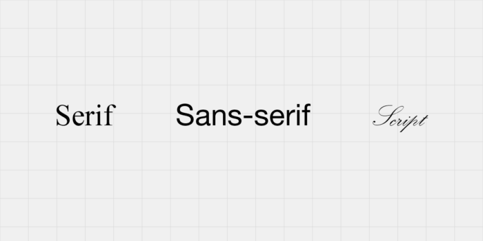
A font is a style of type in which words are written. The type of font you choose for your logo says a lot about your business. Fonts primarily come in three styles:
- Serif: A serif font is one with short strokes or decorations extending from certain letters. These can give a sense of prestige, or a distinguished, traditional feel. Common serif fonts include Times New Roman, Georgia, and Rockwell.
- Sans-serif: A sans-serif font is one without serifs. These are very common for their legibility. They can give a sense of professionalism and offer a clean, contemporary look. Common sans-serif fonts include Helvetica, Century Gothic, and Gill Sans.
- Script: Script fonts are fonts that may resemble handwriting or have a cursive look. These are sometimes hard to read, so proceed with caution. These fonts can give the impression of formality and luxury, but they can also come across as unprofessional. Common script fonts include Edwardian Script, Kunstler Script, and Palace Script.
Color Considerations
Color plays an important psychological role in the perception of your logo by potential clients. It’s important not to be too dependent on color, as your logo may appear without color, in black and white, in certain cases.
- Blue: Calmness, stability, peace, and loyalty
- Purple: Luxury, success, wealth, royalty
- Green: Youthfulness, earth-friendly, health, growth
- Red: Power, passion, confidence, ambition
- Orange: Excitement, energy, joy
- Gray: Elegant, mature, formal, power
Consider an Icon or Mark
If you decide to go with a combination mark, the icon or mark is what you’ll combine with your wordmark. An icon can be useful in setting yourself apart as no two icons should be alike. Make sure you’re not copying anyone else’s icon, and that the icon you select represents your business well. Abstract icons or symbols can be considered, too. It can be a visual combination of two or more ideas that together represent your company. However, it should be easy to understand up close as well as at normal viewing distance.
Consider a Tagline
If you considered a tagline for your company, you may want to include it in your logo as well. Your tagline should be secondary to your company name, so you’ll want to make it smaller and set it up in a way that feels secondary and doesn’t upstage your company name.
Do’s and Don’ts
There’s a lot that can go wrong if this is your first logo design. Don’t stumble out of the gate; take your logo from good to great with these tips.
- Do keep it simple: Your logo should be easy to create and reproduce, such as in printing. Look at the logos mentioned previously. These are simple, good logos. A simple logo will avoid overly fine details that won’t be noticeable if it’s printed small, such as on a business card. These details, in the worst case, will end up compromising the quality of your logo. Keep it minimal and you’ll have an easier time keeping it simple.
- Don’t use more than two fonts: Part of keeping it simple is keeping the number of fonts to a minimum. Use one or two fonts max! Any more and your design risks looking too busy, unfocused, and cluttered. Sometimes a wordmark may combine two font styles or font variations. Alternatively, the tagline may be in a different font than the main logo. These are ways you can use multiple fonts in a logo without going overboard.
- Do stick to one or two colors: Colors, like fonts, are also best used in moderation. One or two color logos are common – and for good reason. Too many colors can be distracting. A little color goes a long way. You can have one primary color throughout most of your logo, and a single accent color used very minimally. This is a great way to add a focal point to your logo.

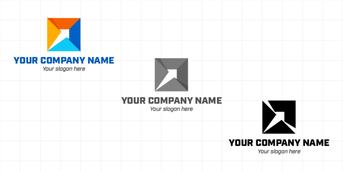
- Don’t rely entirely on color: Another reason fewer colors is better is it makes printing easier in certain situations. If you have two different colors overlapping, consider what it would look like if you had to print your logo in grayscale, or one color only. When would this be the case? If you’re printing your logo on promotional items such as pens or shirts where you’re only allowed one solid color, you’ll need to provide a logo that looks just as good in a single color as it does in full color.

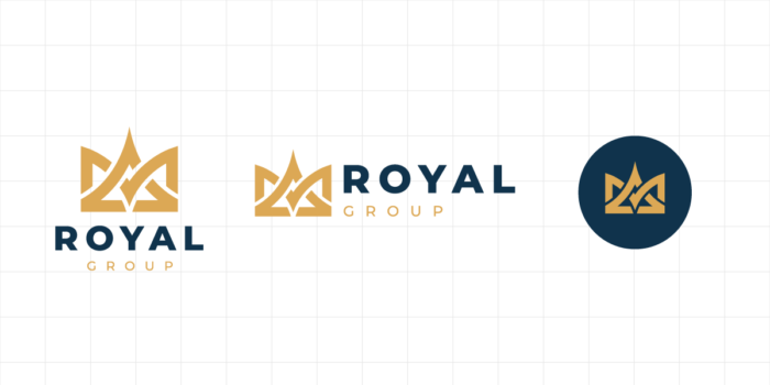
- Do consider context: A good logo is adaptable. Your logo will have to look good as small as on a business card, on your website, and even on social media. Think about how your logo will look in all of these sizes and configurations. For banners, you may need a wider, horizontal logo if your logo is very vertical by default. You may also need a more vertical variation of your logo if it’s very wide horizontally by default. For social media, your logo should fit in a box. If you have an icon or mark for your logo, this will come easily. It’s trickier for wordmarks, however. Some prominent letters or initials will help you look your best in a tiny social media avatar, while your full logo can appear elsewhere in your profile.
- Don’t use bad fonts: Not all fonts are created equal. Some have earned an infamous reputation and can be seen as unprofessional. Don’t risk making a bad impression with a bad font just because it looked fun or easy. Some bad fonts include: Arial, Brush Script, Comic Sans, and Papyrus.
Get Out There and Make a Great Logo!
Now you know why a logo matters – and what goes into logo design. A great logo can be key to your business success and marketing efforts.
About the Author:
Hugo Miramontes is an award-winning designer with The Word & Brown Companies. He earned his degree in graphic design at The Art Institute of California.


